세로 막대 그래프 / 가로 막대 그래프
fig, axes = plt.subplots(1, 2, figsize=(12, 7))

x = list('ABCDE')
y = np.array([1, 2, 3, 4, 5])

axes[0].bar(x, y) # 세로 막대 그래프
axes[1].barh(x, y) # 가로 막대 그래프

plt.show()
막대 그래프에 색 넣기
color 파라미터를 사용하여 색 지정
fig, axes = plt.subplots(1, 2, figsize=(12, 7))

x = list('ABCDE')
y = np.array([1, 2, 3, 4, 5])

clist = ['blue', 'gray', 'gray', 'gray', 'red']
axes[0].bar(x, y, color=clist) # 막대 그래프마다 색 지정
color = 'green'
axes[1].barh(x, y, color=color) # 모든 막대 그래프의 색 지정

plt.show()
y축 범위 공유하기
sharey 파라미터를 사용하여 y축 범위 공유
- 공유하지 않았을 때
fig, axes = plt.subplots(1, 2, figsize=(15, 7))
axes[0].bar(group['male'].index, group['male'], color='royalblue')
axes[1].bar(group['female'].index, group['female'], color='tomato')
plt.show()- 공유했을 때
fig, axes = plt.subplots(1, 2, figsize=(15, 7), sharey=True) # y축 공유
axes[0].bar(group['male'].index, group['male'], color='royalblue')
axes[1].bar(group['female'].index, group['female'], color='tomato')
plt.show()
Staked Bar Plot
fig, axes = plt.subplots(1, 2, figsize=(15, 7))

group_cnt = student['race/ethnicity'].value_counts().sort_index()
axes[0].bar(group_cnt.index, group_cnt, color='darkgray')
axes[1].bar(group['male'].index, group['male'], color='royalblue')
axes[1].bar(group['female'].index, group['female'], bottom=group['male'], color='tomato')

for ax in axes:
    ax.set_ylim(0, 50)

plt.show()
bottom 파라미터를 통해 아래 공간을 비워둔다.
fig, axes = plt.subplots(1, 2, figsize=(15, 7))

group_cnt = student['race/ethnicity'].value_counts().sort_index()
axes[0].bar(group_cnt.index, group_cnt, color='darkgray')
# axes[1].bar(group['male'].index, group['male'], color='royalblue')
axes[1].bar(group['female'].index, group['female'], bottom=group['male'], color='tomato')

for ax in axes:
    ax.set_ylim(0, 50)

plt.show()
Percentage Stacked Bar Plot
left 파라미터를 사용하여 막대 그래프의 왼쪽 공간을 비워둘 수 있다.
fig, ax = plt.subplots(1, 1, figsize=(12, 7))

group = group.sort_index(ascending=False) # 역순 정렬
total=group['male']+group['female'] # 각 그룹별 합


ax.barh(group['male'].index, group['male']/total,
        color='royalblue')

ax.barh(group['female'].index, group['female']/total,
        left=group['male']/total, # left 파라미터 사용
        color='tomato')

ax.set_xlim(0, 1)
for s in ['top', 'bottom', 'left', 'right']:
    ax.spines[s].set_visible(False) # 테두리 제거

plt.show()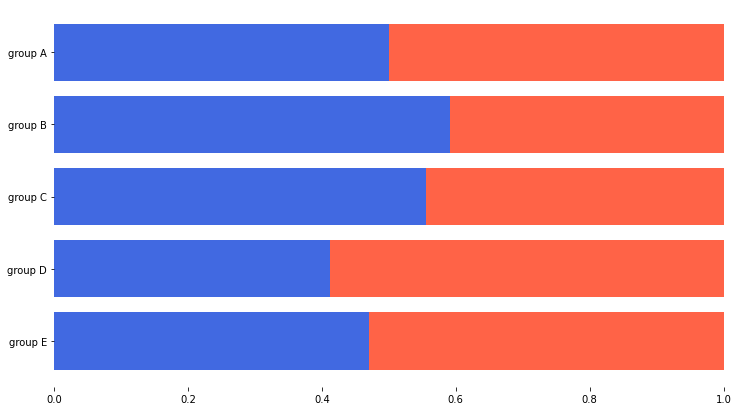
Overlapped Bar Plot
alpha 파라미터를 사용해 막대 그래프의 투명도 조절
fig, axes = plt.subplots(2, 2, figsize=(12, 12))
axes = axes.flatten()

for idx, alpha in enumerate([1, 0.7, 0.5, 0.3]):
    axes[idx].bar(group['male'].index, group['male'],
                  color='royalblue',
                  alpha=alpha) # 투명도 조절
    axes[idx].bar(group['female'].index, group['female'],
                  color='tomato',
                  alpha=alpha) # 투명도 조절
    axes[idx].set_title(f'Alpha = {alpha}')

for ax in axes:
    ax.set_ylim(0, 50)


plt.show()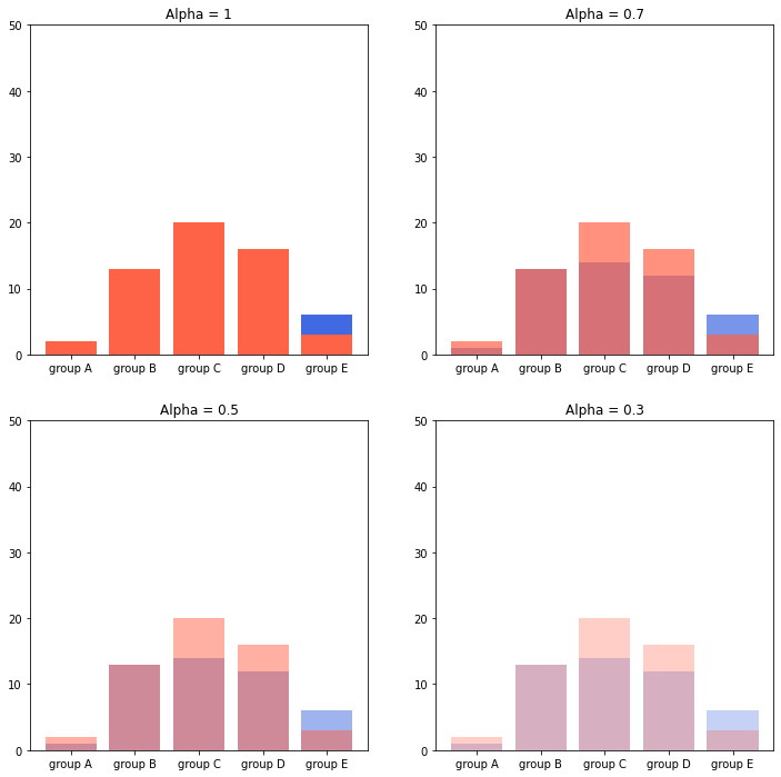
Grouped Bar Plot
- 막대 그래프의 x축 조정
- width 조정
- xticks, xticklables로 x축에 표시되는 값 수정
fig, ax = plt.subplots(1, 1, figsize=(12, 7))

idx = np.arange(len(group['male'].index))
width=0.35

# 막대 그래프의 x축 조정 및 width 조정
ax.bar(idx-width/2, group['male'],
       color='royalblue',
       width=width, label='Male')

# 막대 그래프의 x축 조정 및 width 조정
ax.bar(idx+width/2, group['female'],
       color='tomato',
       width=width, label='Female')

# 표의 x축에 표시되는 값 수정
ax.set_xticks(idx)
ax.set_xticklabels(group['male'].index)

ax.legend()

plt.show()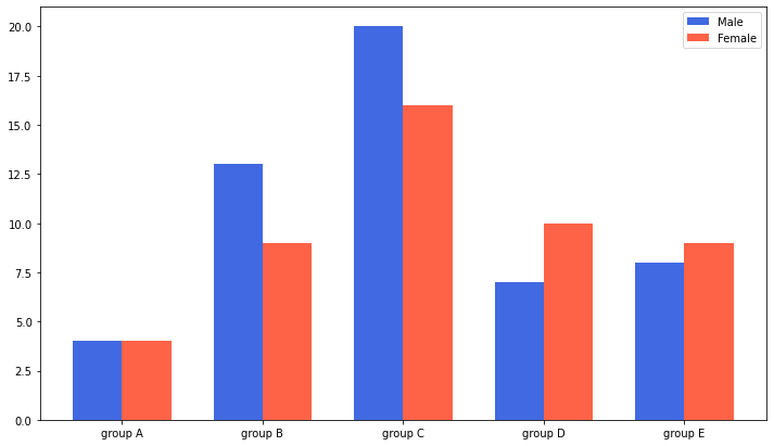
가독성을 높이기 위한 공간 활용 테크닉
- width 조정
- margin 조정
- spine 제거
- x축, y축 최대값 조정
group_cnt = student['race/ethnicity'].value_counts().sort_index()

fig = plt.figure(figsize=(15, 7))

ax_basic = fig.add_subplot(1, 2, 1)
ax = fig.add_subplot(1, 2, 2)

ax_basic.bar(group_cnt.index, group_cnt)
ax.bar(group_cnt.index, group_cnt,
       width=0.7, # width 조정
       edgecolor='black',
       linewidth=2,
       color='royalblue'
      )

ax.margins(0.1, 0.1) # 수평 / 수직 margin 조정

for s in ['top', 'right']:
    ax.spines[s].set_visible(False) # spine 제거

ax.set_ylim(0, 40) # y축 최대값 조정

plt.show()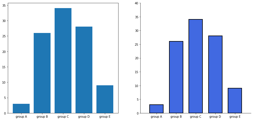
추가적인 정보 제공
- 격자 추가
- 값에 대한 정보 추가
group_cnt = student['race/ethnicity'].value_counts().sort_index()

fig, axes = plt.subplots(1, 2, figsize=(15, 7))

for ax in axes:
    ax.bar(group_cnt.index, group_cnt,
           width=0.7,
           edgecolor='black',
           linewidth=2,
           color='royalblue',
           zorder=10
          )

    ax.margins(0.1, 0.1)

    for s in ['top', 'right']:
        ax.spines[s].set_visible(False)

axes[1].grid(zorder=0) # 격자 추가

for idx, value in zip(group_cnt.index, group_cnt):
    axes[1].text(idx, value+2, s=value,
                 ha='center',
                 fontweight='bold'
                ) # 값에 대한 정보 추가

plt.show()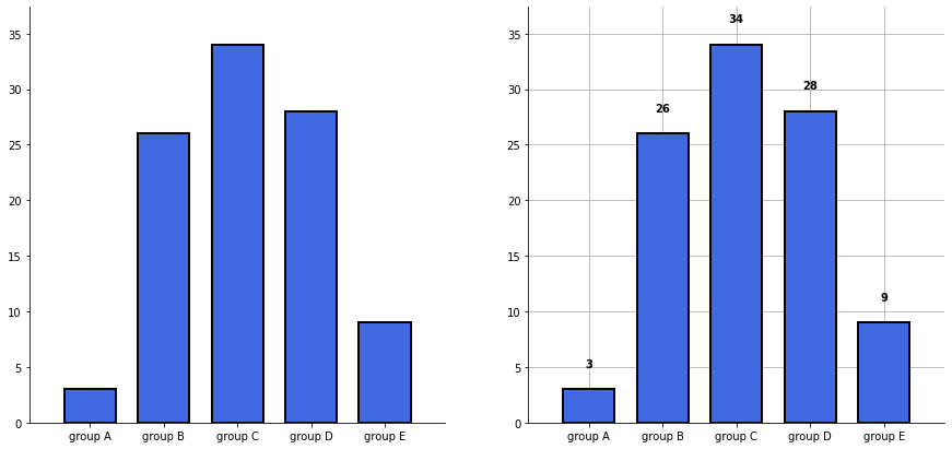
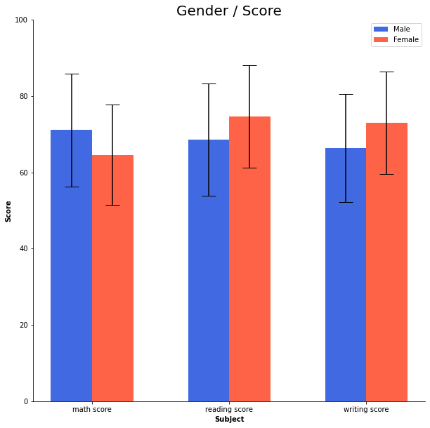
오차 막대
yerr 파라미터를 사용해 오차 막대 표시
score_var = student.groupby('gender').std().T

fig, ax = plt.subplots(1, 1, figsize=(10, 10))

idx = np.arange(len(score.index))
width=0.3


ax.bar(idx-width/2, score['male'],
       color='royalblue',
       width=width,
       label='Male',
       yerr=score_var['male'], # 오차 막대 표시
       capsize=10
      )

ax.bar(idx+width/2, score['female'],
       color='tomato',
       width=width,
       label='Female',
       yerr=score_var['female'], # 오차 막대 표시
       capsize=10
      )

ax.set_xticks(idx)
ax.set_xticklabels(score.index)
ax.set_ylim(0, 100)
ax.spines['top'].set_visible(False)
ax.spines['right'].set_visible(False)

ax.legend()
ax.set_title('Gender / Score', fontsize=20)
ax.set_xlabel('Subject', fontweight='bold')
ax.set_ylabel('Score', fontweight='bold')

plt.show()